AFOSAY - Consulting firm based in the United Arab Emirates
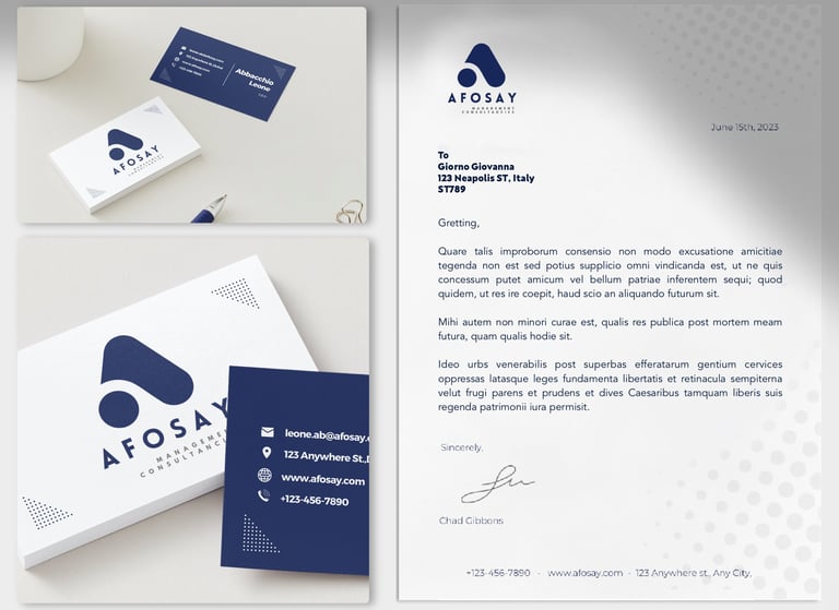
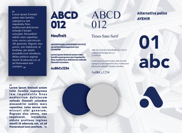
I worked on the visual identity and communication materials for AFOSAY management consulting based in Dubai. Using the letter "A", I designed a flat monogram in corporate blue and gray to represent their professional expertise. These colors were chosen for their association with stability, trust, and credibility, important values in consulting.
In addition to the logo, I also designed a professional business card, letterhead, and other communication materials.

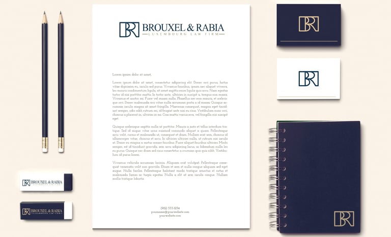
BROUXEL & RABIA - Luxembourg law firm
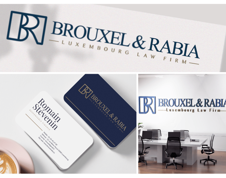
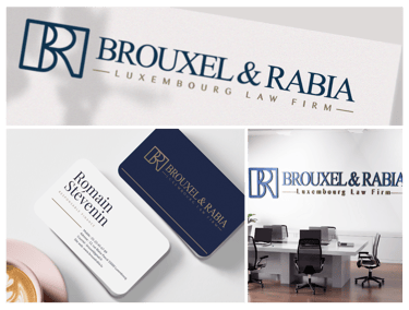
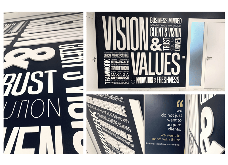
Brouxel & Rabia entrusted me with the task of creating their visual identity and communication materials.
I worked closely with Samia (Partner) and Nacera (Marketing Director) to design a modern and corporate logo inspired by the Anglo-Saxon style of the legal domain. The visual identity highlights the expertise and professionalism of François Brouxel and Samia Rabia through a monogram formed by their initials, symbolizing rigor and trust. The chosen colors, navy blue and gold, add a corporate and elegant touch, reinforcing the image of high standing they wish to convey.
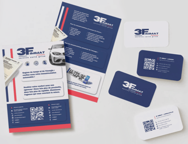
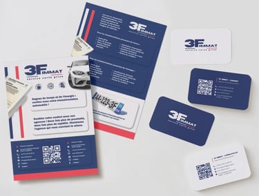
3F IMMAT - Vehicle Registration Agency
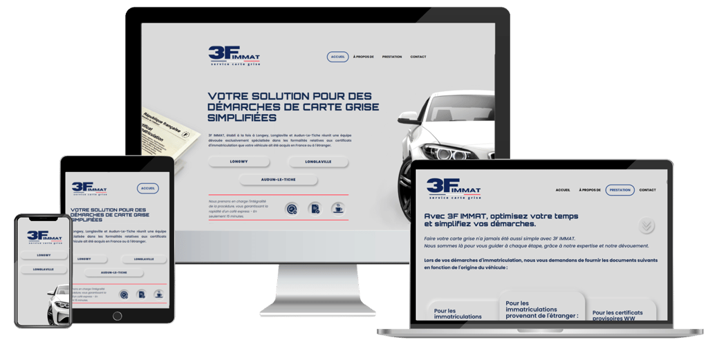
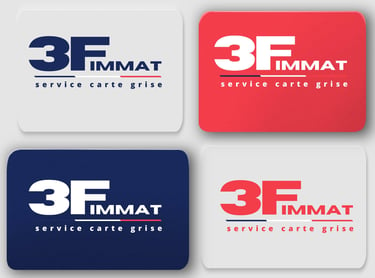
I had the pleasure of creating the visual identity for 3F IMMAT, a specialist in vehicle registration. Using the initial '3F', I designed a distinctive logo in blue, white, and red, reflecting their professionalism and commitment. This project also included the development of a modern and user-friendly website, providing a coherent online presence aligned with their brand image.

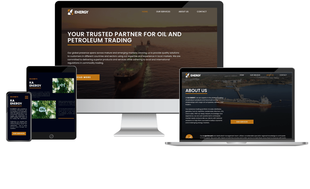
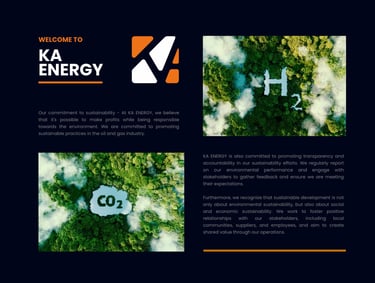
KA ENERGY - Company based in Dubai specialized in petroleum products trading
DIMZDEV - Web Developer
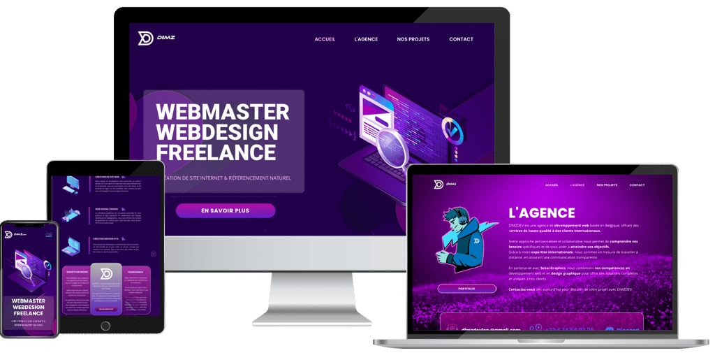
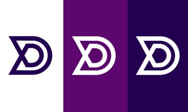
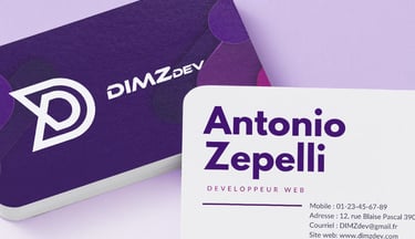
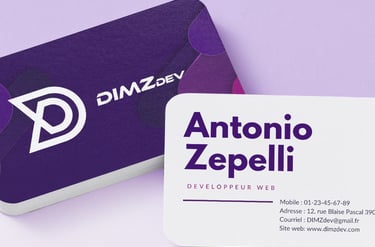
I had the pleasure of designing the logo for a freelance web developer. The logo I created for him is a representation of his expertise in coding, web development, and programming. The logo features a stylized "d" in the shape of code. The colors chosen for the logo, especially purple, add a touch of sophistication and creativity to the overall design. Purple is associated with innovation, imagination, and technology, which perfectly aligns with the world of web development.
213TH - Restaurant
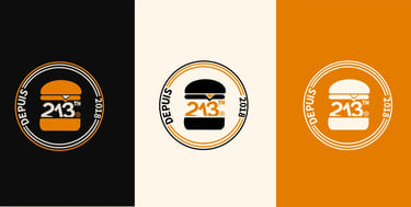
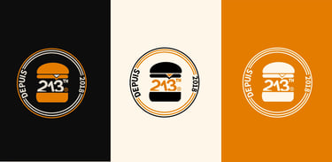

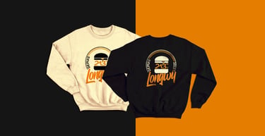
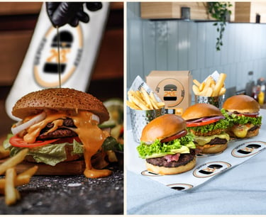
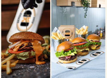
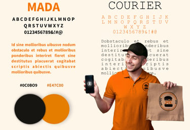
213TH entrusted me with the creation of its visual identity. I designed a circular logo, inspired by the style of major fast-food franchises, to represent its image. The choice of orange and black colors reflects the colors of the city where the restaurant is located. In addition to the logo, I also created communication materials and designed a logo for a sweater.
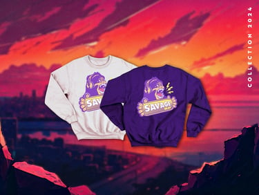
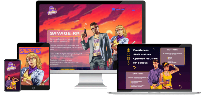
SAVAGE RP - Server GTA V
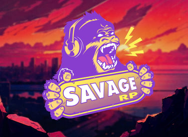
I had the opportunity to create the logo for a GTA server called "Savage RP" in a gaming theme. To reflect the dynamic atmosphere of the server, I chose vibrant colors such as yellow and purple. Yellow evokes strength, power, and action, while purple adds a touch of mystery and creativity. The screaming gorilla in the logo symbolizes determination and courage.
